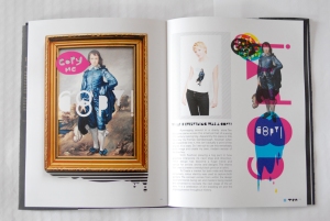
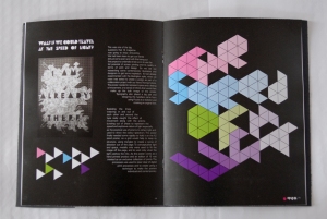
TEN MAGAZINE PRINTED (IMAGES)
January 15, 2009
LOOK WHO FORGOT SAGMEISTER!!
January 15, 2009
I can’t believe i haven’t even mentioned my all time favorite graphic designer. Introduced to me by our tutors at college i was completely unaware of sagmeister and his infectious style of the multi-skilled man! From creating stories out of sausages, to designing for the Rolling Stones to cutting into his body to produce a lecture poster for his tour Sagmeister is a true hero of our contemporary design world. He is also very helpful for design students looking to make their way into the design world with a similar vision for the all out style he has come so well known for. My Favorite piece though, is his poster i mentioned earlier. Cutting into his body using a tattoo artist to perform the work, Sagmeister has the details of his tour carved into his flesh, thus showing us the metaphoric pain that is endured when travelling along the path of design. What a hero!
Susan Kare.
January 14, 2009
Now growing up, all those little pixel graphics seems amazing, they were the height of technology, in the 80’s through to the early 90’s. Susan Kare is possibly responsible for much of what you clicked on, as icons on your computers. She designed for mac (that old version of solitaire and the little load graphics) I came across Kare through an issue of Grafik, ![]() and thought it would be great for you all to see who designed those little icons you hold so dear….information graphics in a sense. Her thesis for the icons were that they were easily identifiable and without clutter like road signs. Her work is similar to a contruction of mosaic grids as the simple pixels create the minimalist identity for big software companies such as MAC computers.
and thought it would be great for you all to see who designed those little icons you hold so dear….information graphics in a sense. Her thesis for the icons were that they were easily identifiable and without clutter like road signs. Her work is similar to a contruction of mosaic grids as the simple pixels create the minimalist identity for big software companies such as MAC computers.
MELVIN GALAPON!
January 9, 2009
Melvin is an English boy born and bred. He works mostly with sticky tape and labels creating exciting typographic outcomes and making bright and brilliant pieces of work. His instillation pieces often cover a lot of space, lines of colour weaving in and out of each other as they place around architecture and over objects. His work for Nike seems most suitable because his work often represents sports stripes and goes hand in hand with the tasks set out by Nike he decorated a bench using the different coloured tape. He’s largely known for his poster work, using sticky labels to create amazing typographic pieces for the university exhibition for YCN titled “SHOW OFF”.
Julien Vallée AMAZING!
January 8, 2009
Julien has got to be one of my most favorite analogue designers i have seen in a long while. On the same tone as Pierri Vanni, Julien works with paper and materials to create elaborate worlds often exploding out of anything and everything, mixing sculpture, materials techniques such as after effects and typography. He’s worked with some big names such as MTV and The New York Times, animating and generally making them look really good. His work has been published all over the place, in the book 3D graphic space, his work can be seen and shows details of how and what he does to create those amazing sculptures.
Pierri Vanni
January 3, 2009
Pierri Vanni sculptural work is completely paper based, creating a completely analogue effect. His work is based around the theme of electronic music and how easy it is to put a few sounds together with a beat and call it music. He’s collaborated with Lyons electronic music festival to create a small video based on the Nintendo game Star-fox, using a bit of after effects to create an ammusing special effects connudrum. His video titles Romantic Justice, worked alongside the Paris Duo Justice at the festival, you can check the clip out at vimeo HERE, it’s truely brilliant. But its his sculpture work that first attracted me to Vanni, his geometric designs and impressive Running Rabbits.
Siggi Eggertsson Illustraor and designer
December 30, 2008
 Siggi Eggertsson, is an Icelandik Bloke who enjoys a bit of the old Illustration….basically if you like geometric art and love Iceland, this guys right for you. This guys been all over the place, New York, Berlin, His home land Reykjavík captial and now london, where the lucky old gezzer works for big active with the likes of Rachel Thomas, Parra and many more great minds. His work is largly based around the use of geometric shapes to create images of animals, people and landscapes, but he has been known to dabble with typography and illustration. Siggi has been everywhere and in my ealier part of my blog he’s on the cover of my issue of IDN, and MAN i wish i could do something as cool as that! He’s created posters for “If You Could…” and created the image for Knarls Barkley’s new album cover. He’s just great!
Mike Perry Designer & Illustrator
December 30, 2008
I came across Mike Perry on the cover of an Issue of Grafik, now getting yourself on the cover of any magazine is a big deal, so i guessed this guy would be as well. He’s an American boy from Minneapolis, his recent publication “Hand Job” Is a collection of hand illustrated typographical treatments for all sorts of text and in imaginative outcomes. His other work, is based mainly around illustration and uses that as his main medium to communicate ideas. His style reminds me of the cut and paste accuracy of being in primary school and as you may have read i love the nostalgic forces of using limited style and technique to create a new exciting visual style that has no boundaries, it almost comes under the term of vernacular and is almost an instinctive style from his younger years. click the images to whizz yourself over to his web page. 


Antoine+Manuel Design
December 30, 2008
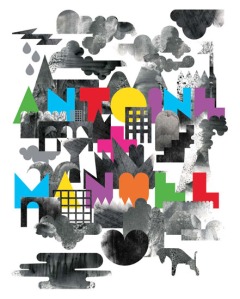
I’ve been searchin everywhere for some information about these guys, haven’t found anything, unless it’s in french, and that do esnt help me. The most i know about these Parasian Duo is that their work and style is so heavily used by all the people you’re about to see me upload on here. These guys have been around for a little while and designed so much, interesting colourful and playful pieces it’s insane. They are some true heros of mine. But finding out about them is a poo! The first piece is a poster titlted Gods from their Exhibition in the Degin Museum which took place in Breda, Netherlands. They have a Volume of their works coming out in January which is a really exciting as it concretes their place as serious and high profile designers. Their work is a mixture of shape and texture, often incorperating charaxters weaving in and out of their works. Its so much fun following their designs around like being on a journey through it. Anyway click the image to enjoy their works, and i hope they inspire you as much as they have me!
Parra Breakfast Video (WARNING:// HAS NAUGHTY LANGUAGE!!!)
December 23, 2008
I now own this Ep and its well worth it to have a bit of Parra in my life! I really think this is the perfect extention of his art work and completly compliments his visions!! AMAZING!!


